I've had a busy couple of weeks design-wise. First, I was contacted by Julie at
That's Swell to do a header for her blog. Julie wanted something that went with her blog's retro theme and preferably incorporated books, an antique typewriter, and butterflies. She said that she liked the 40's and 50's look when it came to the retro part.
I spent quite a few hours trying to decide which retro look to go with, Googling pictures of hair and clothes from that time. I finally went with the victory roll look:

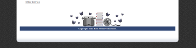
Julie also wanted something for the footer area, but because her blog in on GoDaddy's Blogcast platform, we were limited to replacing a vine that was in a small area in the middle of the footer:
Next Tracee from
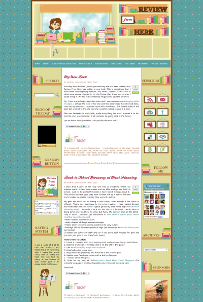
Review from Here asked me about doing a Wordpress design for her. A few weeks ago I had opened a free Byethost account so I could play around with Wordpress. The only theme that I had gotten a chance to do anything with was the Atahualpa theme, which you can see here:
Blogging Bella 2.0. I had taken an old vector that I had purchased, slapped it on a test header, and played around with the theme's setting to see if it was as customizable as theme's designers had claimed. From what I could tell, it seemed to be.
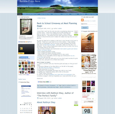
That was just playing around though. Luckily, Tracee was willing to be my guinea pig for my first real Wordpress design using that theme. Here is Tracee's before shot:
And here is her after:
Tracee does both book and product reviews on Review from Here. Her previous button was of a window seat so I built off that idea by having a cartoon her sit on another window seat with a laptop, surrounded by books, shopping bags, and products that have been mailed to her in a box.
For the footer, I carried on that same idea but had the seat as a built-in between two bookcases, which are represented by the sidebar and the bookshelf sidebar titles. The social icons then became picture frames, a shape that's repeated in the header, while her rating system turned into her sitting on a stool, holding up signs with the numbers 1 through 10. You can see that on her left sidebar in the after shot.
I also did a
Twitter page for Tracee. I forgot to do a before shot of it, but here is the after:
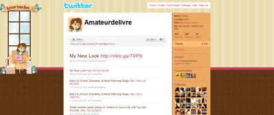
After Tracee's Twitter page, I did one for Missie at
The Unread Reader. Again, I only have an after shot for it:
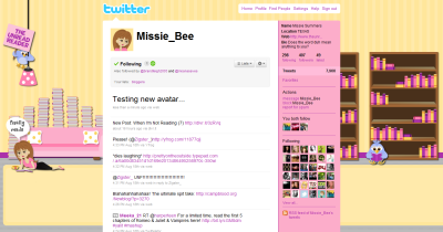
Both Twitter pages show differently on different resolutions, since Twitter insists on aligning the backgrounds from the left side of the screen instead of from the center.
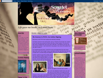
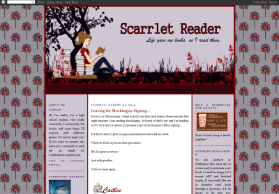
I'm now beginning the design for Missie's giveaway winner,
The Scarrlet Reader. I hope to have pictures of it up soon.